[Usage Scenario]
A line chart is a commonly used type of chart to display changes over time. It connects data points with lines to show the trend of variables, and is suitable for the following scenarios:
Time trend analysis: Line charts are suitable for displaying time series data, such as daily, monthly, or quarterly sales, user visits, or inventory changes, to help users identify long-term trends.
Seasonal changes: By observing the fluctuations of the line, it is possible to analyze the periodic changes in the data. For example, seasonal fluctuations in sales revenue, changes in user activity during different time periods, etc.
Comparison trend: Multiple lines can be used to compare the changes in multiple variables. For example, comparing sales trends of different products, or comparing user growth trends in different markets.
Abnormal discovery: The prominent peaks or valleys in a line chart help identify abnormal situations in the data, such as an abnormal increase in sales or a sudden decrease in user churn in a certain month.
[Function Introduction]
A line chart is used to display the changes in data over a continuous time interval or span, and its characteristic is to reflect the trend of things changing over time or ordered categories.
The composition of a line chart includes:
- Horizontal axis (X-axis): The horizontal axis in a line graph is the horizontal axis, usually used to display continuous variables such as data classification or time.
- Vertical axis (Y-axis): The vertical axis in a line chart is the axis in the vertical direction, usually used to display numerical values or quantities of data.
- Point: Each point represents the data value at a specific position on the horizontal and vertical axes. In a line chart, the line connecting all points can show the trend and change of the data.
- Line: The lines in a line chart are straight lines formed by connecting data points, representing the trend of data changes. The trend of the lines can intuitively show the growth, decrease, or fluctuation of the data.
【Basic Attributes】
The basic properties of a line chart are as follows:
| 横轴 | 纵轴 | 分组 | 参考线 |
| 最多1个字段 | 可选多个字段,最多30个字段 | 最多1个字段 | 可选多个字段,最多30个字段 |
【配置步骤】
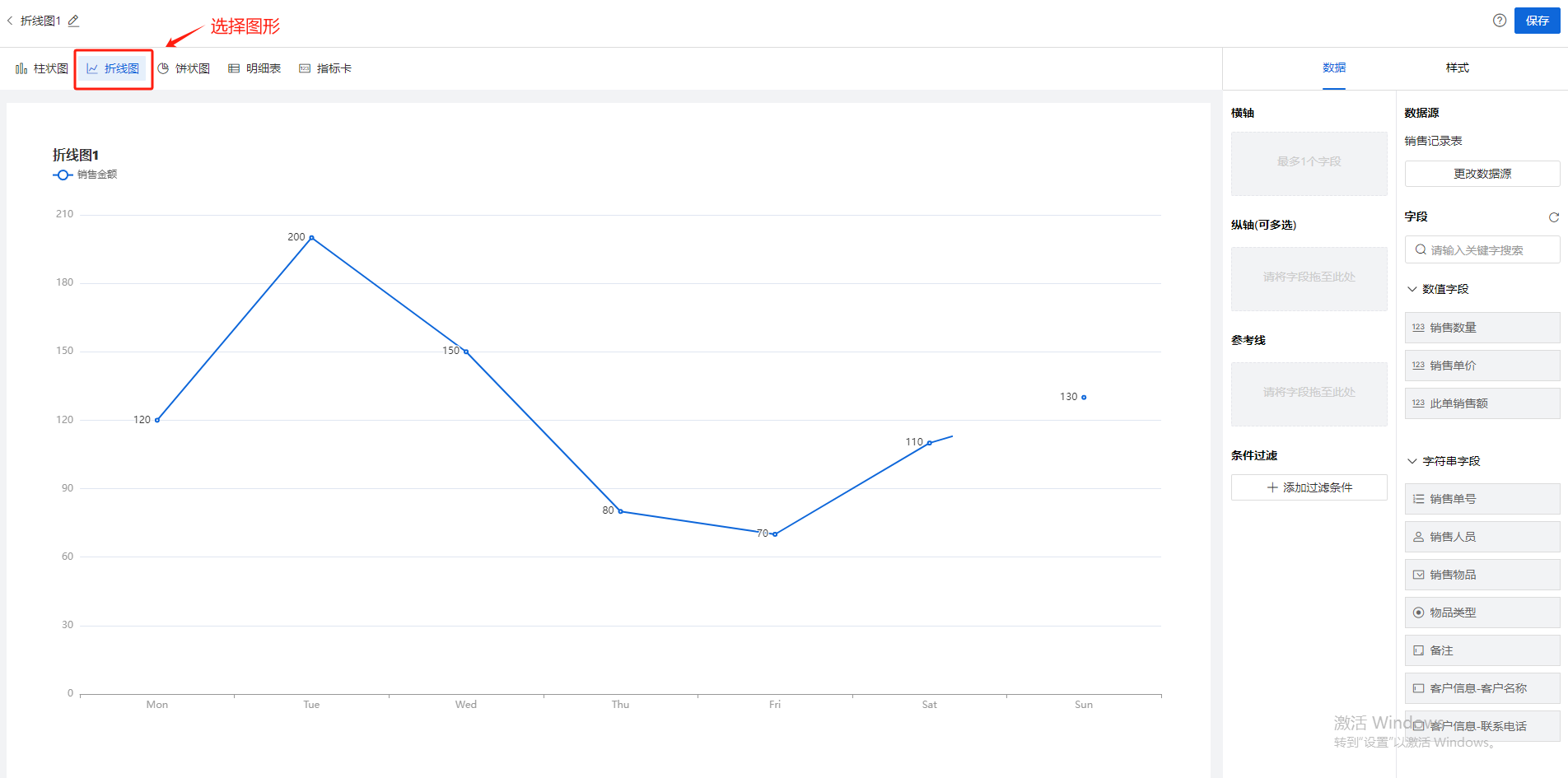
Step-1 选择图形
创建报表,选择折线图,如图:
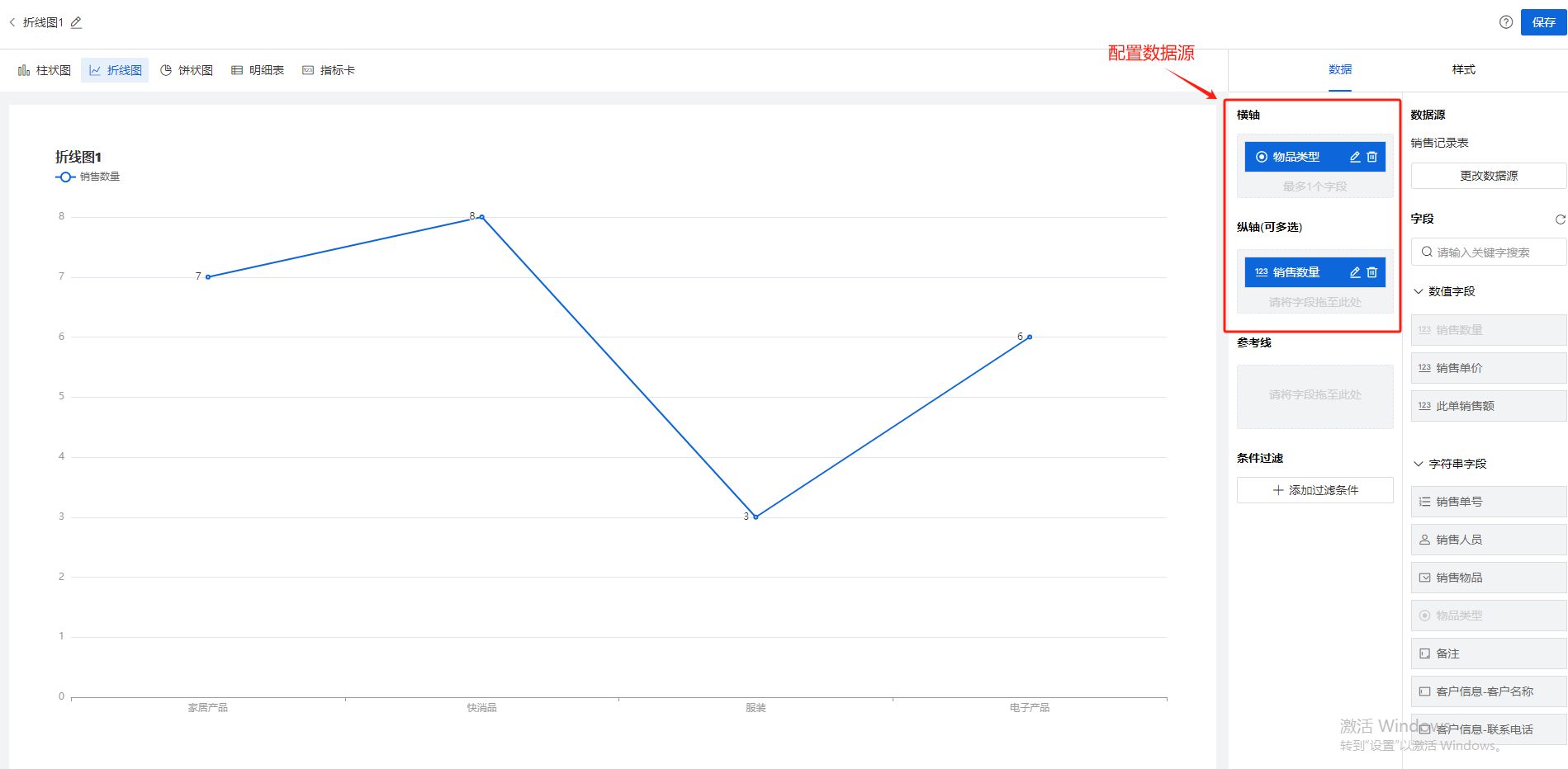
Step-2 选择图表展示字段
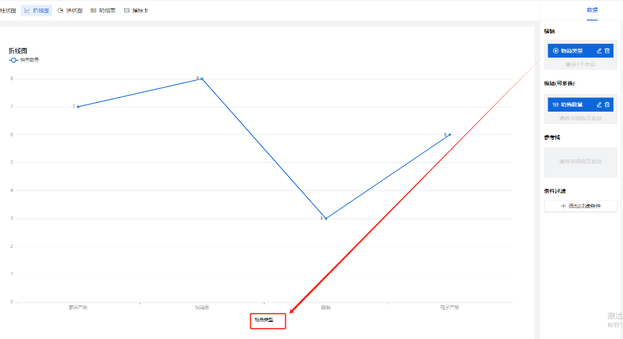
将右边数据源列表中的字段拖动放到【横轴】、【纵轴】、【分组】、【参考线】上
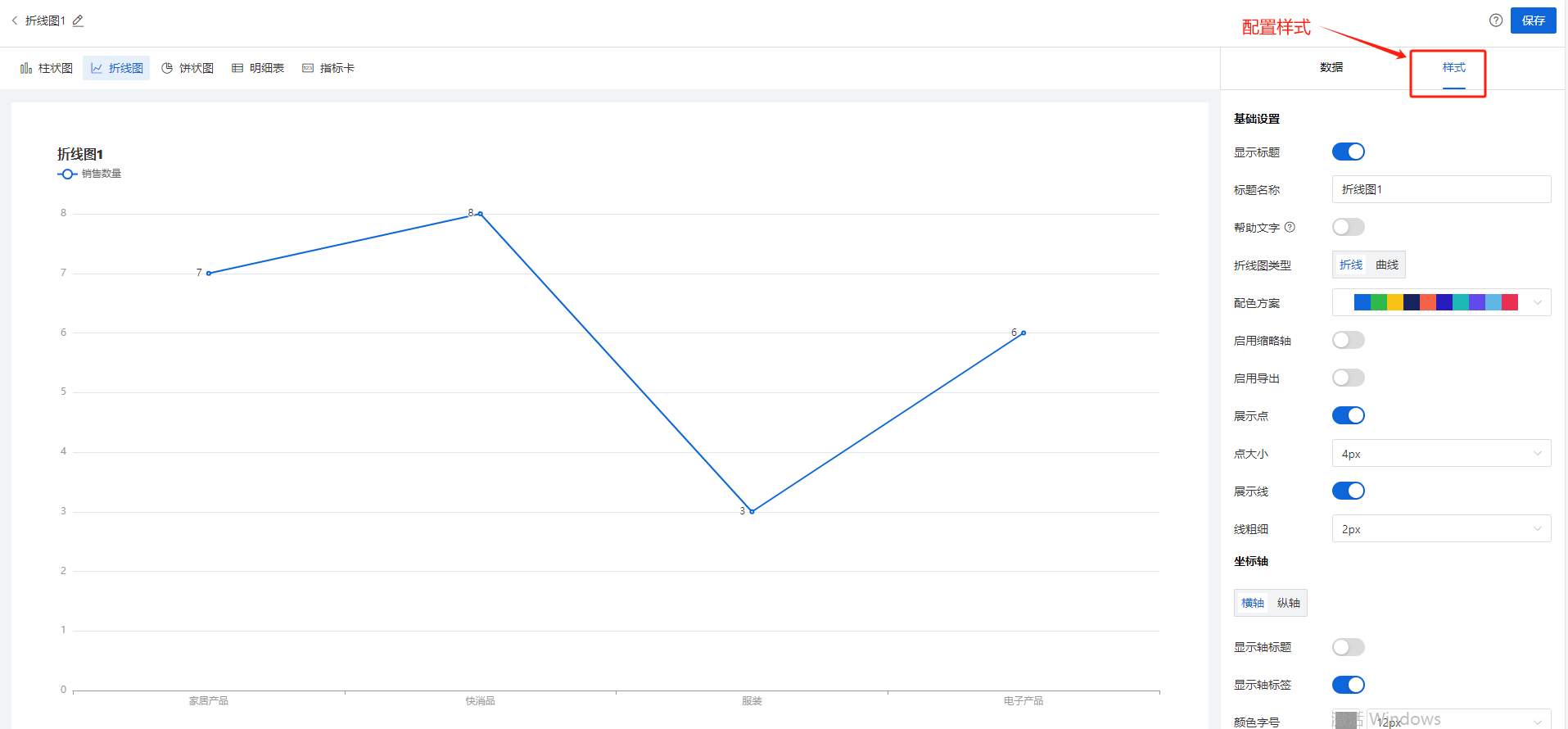
Step-3 样式设置
分为三小类:【基础】、【坐标轴】,【图例】,如下图
【样式配置说明】
| 样式设置分类 | 配置项 | 用途 |
折线图
| 基础
| 显示标题 | 控制画布左上角的标题是否显示的开关
|
标题名称 | 支持用户自定义报表标题 | ||
帮助文字 | 开启后,标题右侧出现小问号,鼠标悬浮时,出现帮助文字具体内容 | ||
帮助文字内容 | 支持用户自定义帮助文字的文案,例如“这是本月销售订单总额的统计” | ||
折线图类型 | 支持2种类型:折线、曲线
| ||
配色方案 | 支持用户自定义(多Y轴时)整体的配色方案 | ||
显示缩略轴 | 支持用户设置针对横轴的缩略轴,即:查看横轴上某一区间的数据 | ||
展示点 | 默认打开,关闭后画布上不显示折线的每个描点
| ||
点大小 | 控制折线图中点大小
| ||
展示线 | 默认打开,关闭后折线的线段消失,只显示点(类似散点图)
| ||
线粗细
| 支持用户控制折线的线段粗细 | ||
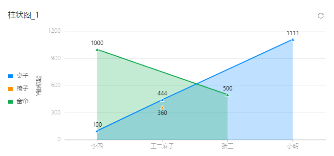
填充
| 默认关闭, 打开后每个点向下填充半透明的颜色到X轴,效果如下:
| ||
横轴
| 显示轴标题
| 开启后,画布中横轴下方,将显示用户配置的横轴的数据源的标题
| |
轴标题名称
| 支持用户自定义想要的轴标题名称文案 | ||
颜色字号 | 支持用户自定义轴标题的颜色和字号 | ||
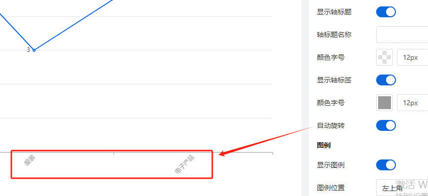
轴标签 | 控制是否显示轴标签的开关,如下图:
| ||
(轴标签)自动旋转 | 轴标签会斜45°显示,如下图
| ||
纵轴
| 显示轴标题
| 开启后,画布中纵轴左侧,将显示用户配置的纵轴的(第一个数据源)的标题 (图中:“Y轴标题”是轴标题, “桌子、椅子、窗帘”是图例)
| |
标题内容 | 支持用户自定义想要的轴标题名称文案 | ||
轴标签 | 控制Y轴轴标签是否显示的开关
| ||
刻度数 | 支持用户配置的Y轴的刻度数(注意:这里的刻度数是一个预估值,报表引擎在渲染时可能会根据实际情况改变最终呈现的刻度数) | ||
| 图例
| 显示图例 | 默认开启, 关闭后则不显示图例
|
| 图例位置 | 图例默认出现在画布的左上角,同时支持用户设置图例在画布中的位置 | |
| 颜色字号 | 支持用户根据需要自行调整图例的文字颜色和字体大小 |