[Usage Scenario]
A pie chart is a commonly used type of data visualization chart that presents data as a circular shape resembling a pie chart, displaying the proportions of different data classifications in a fan-shaped manner. It is suitable for the following scenarios:
Proportional display: A pie chart is suitable for displaying the proportion or proportion relationship of different categories in the population. For example, market share, the proportion of various expenses to total expenses, etc.
Category Display: A pie chart can classify and display data according to different categories, visually showing comparisons between different categories. For example, the sales proportion of different products, the sales proportion of different regions, etc.
Trend analysis: By observing the size changes of each sector in the pie chart, the trend and changes of the data can be analyzed. For example, seasonal changes in sales revenue, changes in the proportion of users in different age groups, etc.
Highlights: Specific data or categories can be emphasized by highlighting a sector or several important sectors in the pie chart. For example, highlighting the market share of a certain product, highlighting the sales proportion of a certain region, etc.
[Basic Requirements ]
The basic requirements for a pie chart are as follows:
| Category Field | Mumeric Field |
| Only one field can be configured | Only one field can be configured |
Only one field can be configured
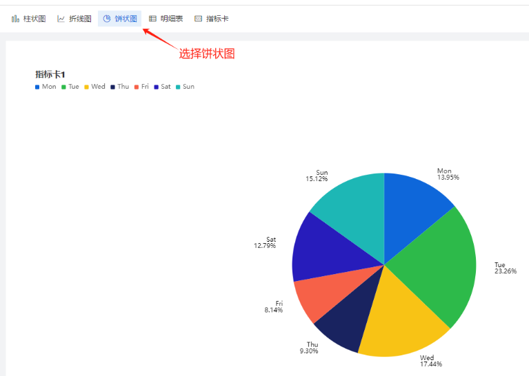
Step-1 Select components and configure data sources
Create a report, select the pie chart in the upper left corner, and then choose the data source, as shown in the figure:
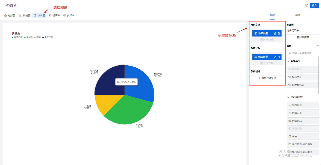
Step-2 Select chart display fields
Drag and drop the fields from the data source on the right onto the classification and numerical fields
Data source for pie chart:
With the classification field and numerical field, it is possible to draw the correct pie chart based on the actual situation of the data. In the following figure:将销售物品类型拖入分类字段中,将销售数量拖入数值字段中,则可以得出:【按照销售物品类型分类后的销售数量的统计饼状图】
Classification field: This field represents the category or classification of the data, and each data point should have a corresponding category. The category field can be product name, region name, department name, etc., used to indicate the specific category to which the data belongs.
Numerical field: This field represents the specific numerical value/quantity for each category. Numerical fields can be sales revenue, sales quantity, market share, etc., used to represent the proportion or percentage of each category in the overall population.
If a non numeric field (such as string, date, location type) is dragged into a numeric field (dashed box), the string, date, location will be converted to the number of times the field appears based on the default aggregation method (count)
Step-3 Style settings
Divided into three categories: Basic Settings, Labels, and Legends, as shown in the following figure:
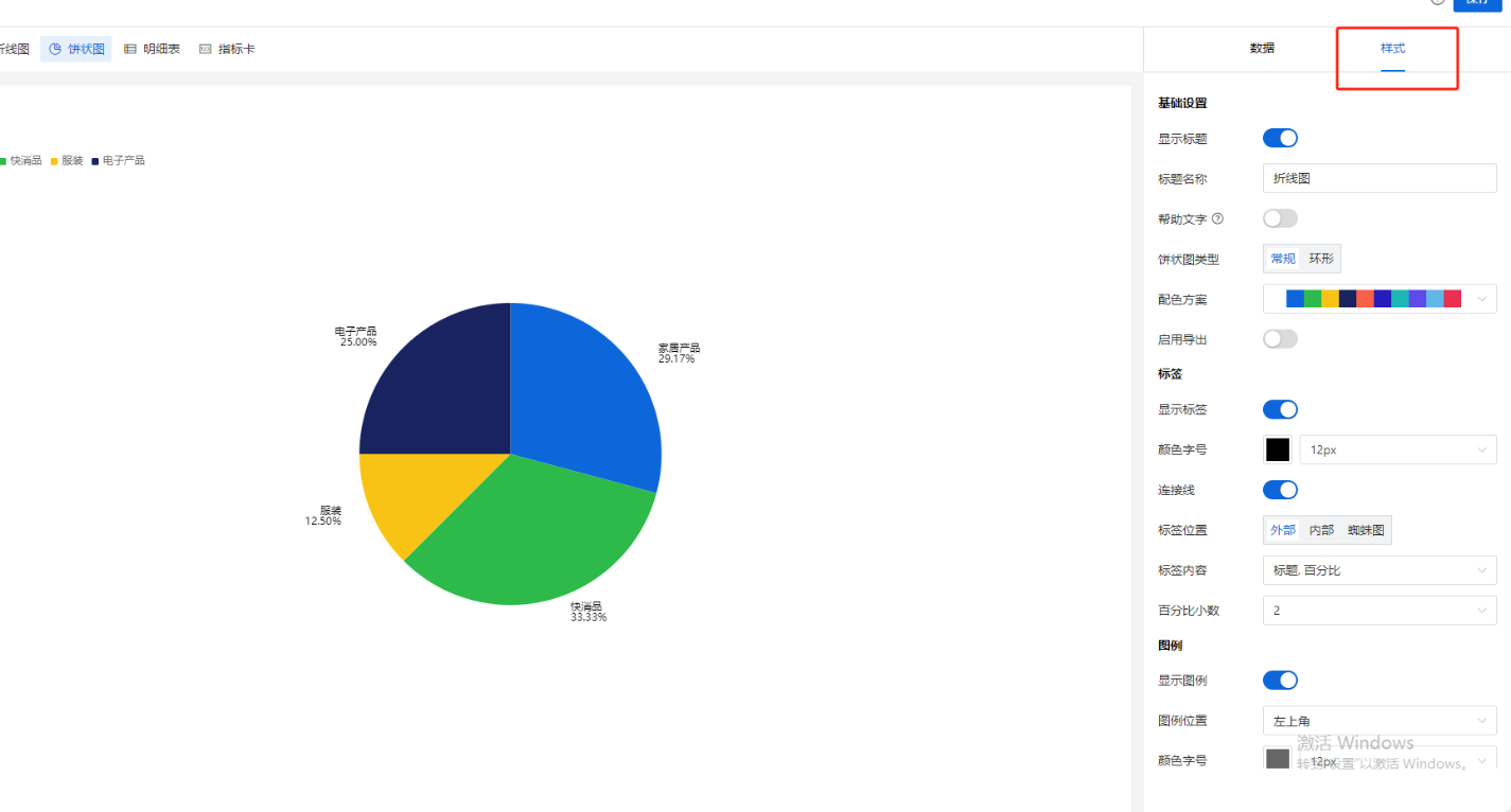
[Style Configuration Description]
| Classification | Configuration Items | Purpose |
Basic Style
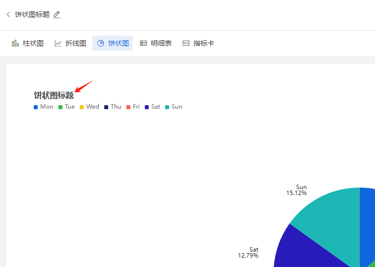
| Show heading | Control whether the chart title in the upper left corner of the canvas is displayed. When closed, the chart title will not be displayed in the report, The words "柱状图1" are shown in the following figure;
|
| Chart title | You can name the chart by yourself | |
| Help text | Control whether the help copy is displayed in the chart. If enabled, client users can see a "?" icon after the chart title and the corresponding help copy when moving the mouse over the icon;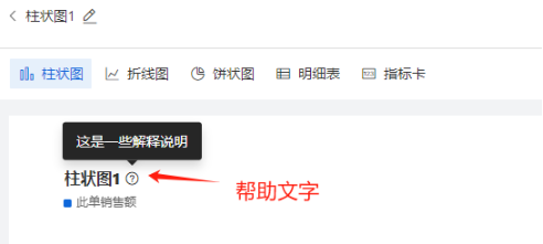 | |
| Help text content | Enter a description of the chart here to help client users understand the chart data; | |
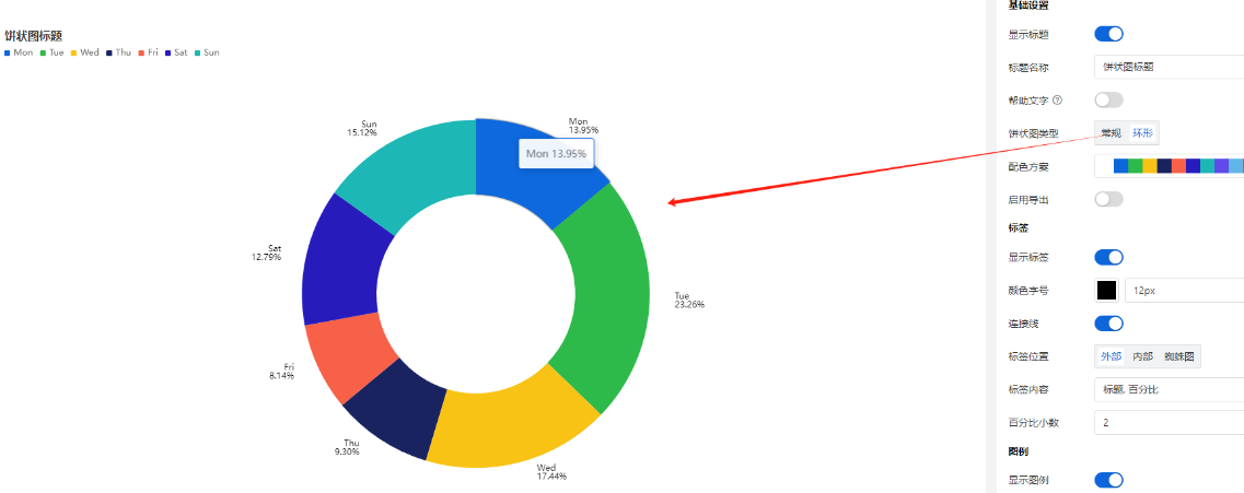
| Pie chart type | By default, "General" is selected. The second option is a circular chart, which has the following effect:
| |
| Color scheme | Customize the color scheme of the Y-axis pillar; | |
标签
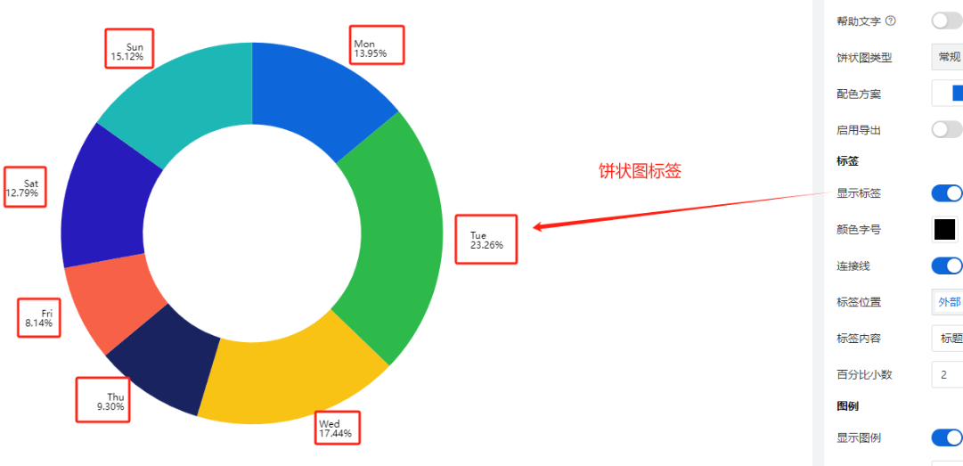
| 显示标签 | 控制是否显示标签的开关,如下图:
|
颜色字号 | 略 | |
标签位置
| 支持3种模式:内部,外部,蜘蛛图 | |
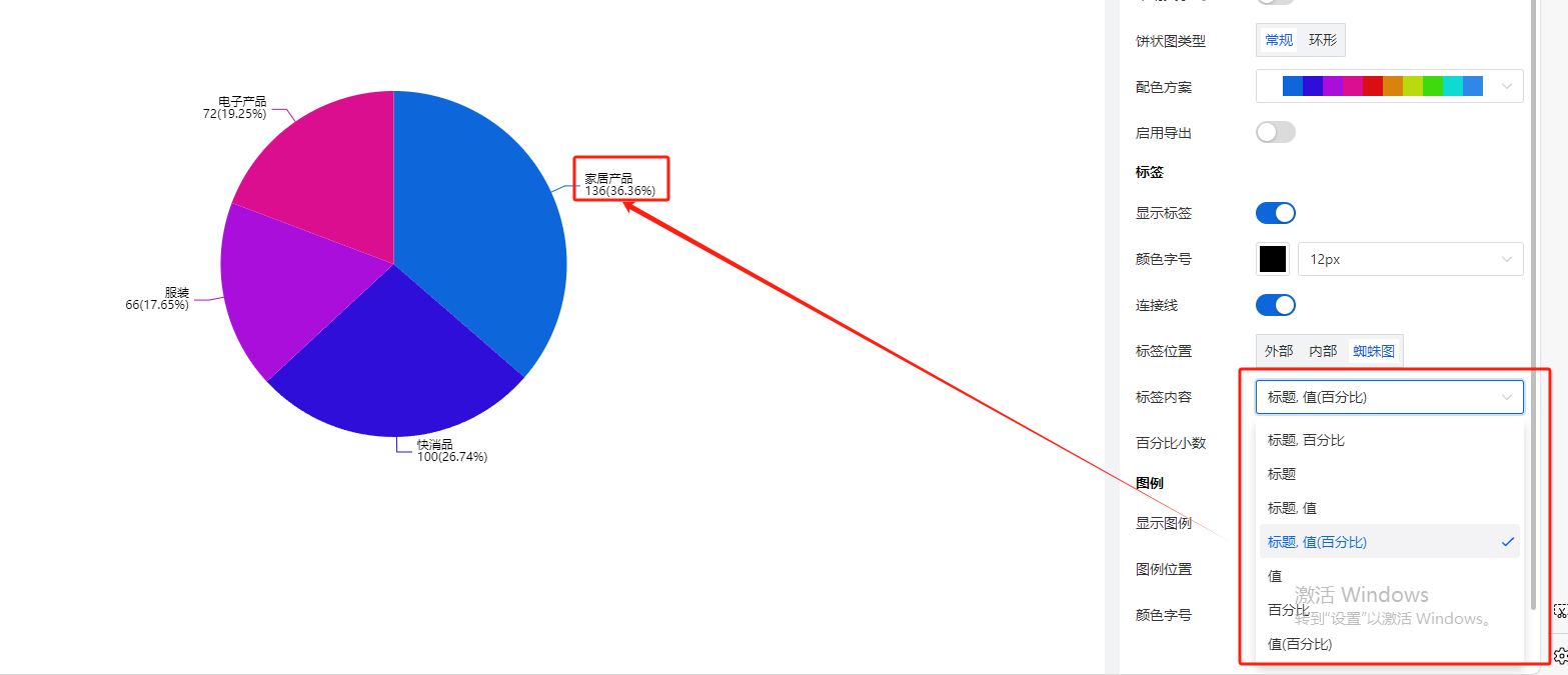
标签内容
| 是标题、百分比、值的各种排列组合,默认选择【标题,百分比】如下,用户也可以改成其他内容,例如“标题,值(百分比)”,如下图:
| |
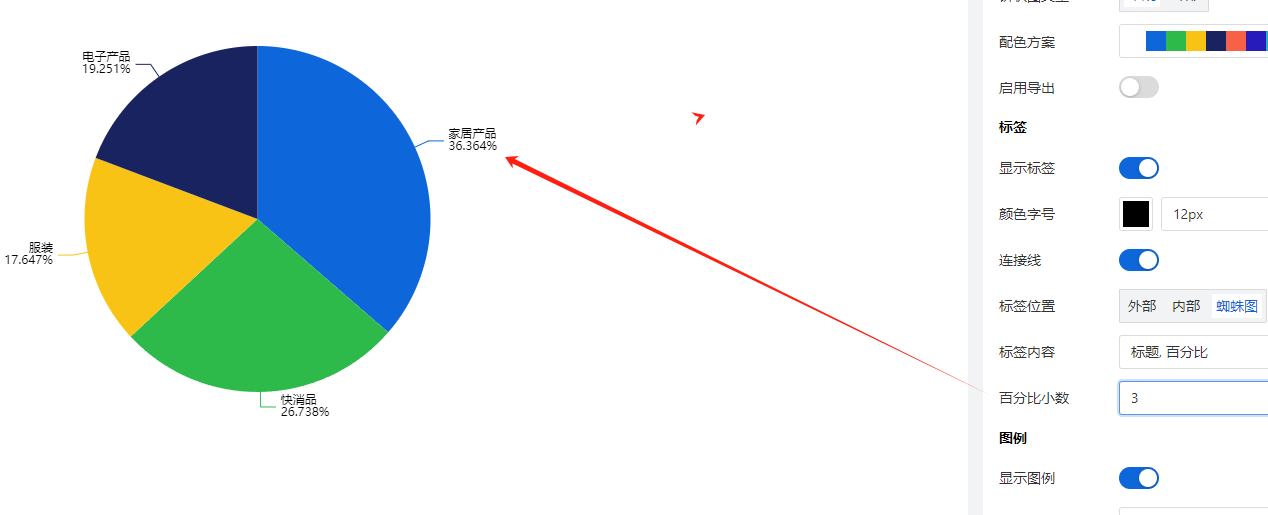
百分比小数位数 | 设置上述标签内容中,百分比的小数位数,例如设置成显示3位小数,如下图:
| |
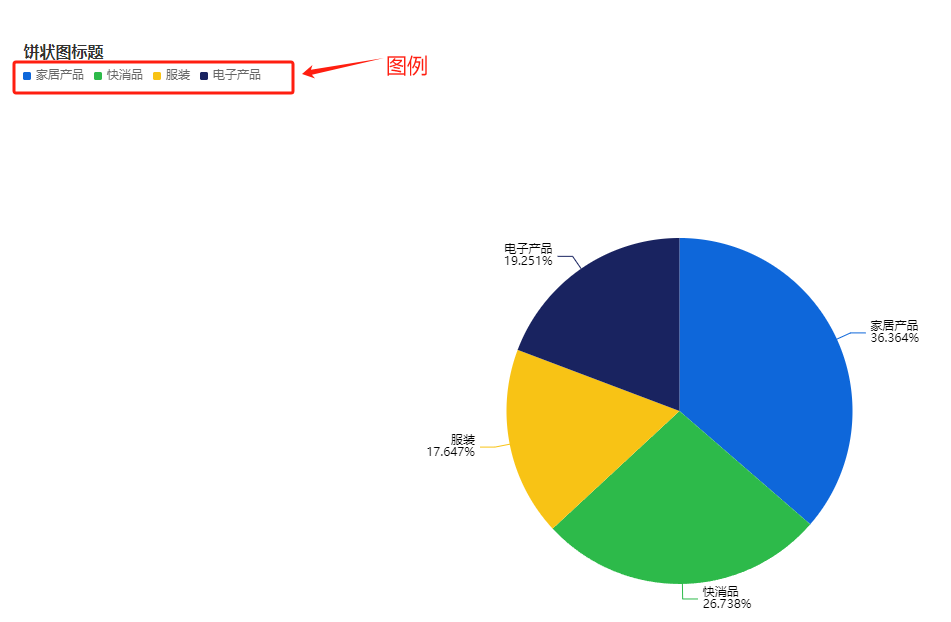
图例 | 显示图例 | 默认开启, 如下图:
|
图例位置 | 图例默认出现在画布的左上角,同时支持用户设置图例在画布中的位置
| |
颜色字号 | 支持用户根据需要自行调整图例的文字颜色和字体大小 |