
[Usage Scenario]
It is suitable for scenarios that require directly highlighting key data. For example, indicator cards can be used to display metrics such as total product sales, delivery quantity, and warehouse inventory levels.
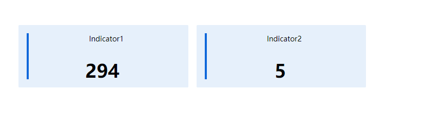
As shown in the figure below, the indicator card directly displays the total sales amount, effectively highlighting this key metric in a card format.
[Basic Requirements ]
| Indicator | Indicator field type |
| Required, maximum of 8 fields. | Must be an aggregatable field. |
Indicator:The numbers displayed in the indicator cards are aggregated results, meaning that the indicator cards must exclusively show numerical values.
[Configuration steps]
Step-1 Select chart and configure data sources
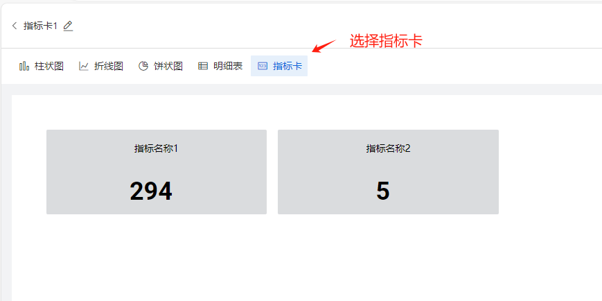
Select the 'Indicator Card' in the chart selection panel: Clicking the indicator card on the homepage displays demo sample data, as shown in the figure below.
Step-2 Add indicator field
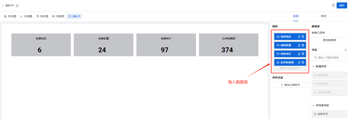
In the chart selection panel, select 'Add Metrics to Indicator Card graphic': Drag dataset fields into the Metrics section.
Step-2 Style settings

[Style Configuration Description]
| Classification | Configuration Items | Purpose |
Basic Style
| Show title | Control whether the chart title in the upper left corner of the canvas is displayed. When closed, the chart title will not be displayed in the report, The words "Sales atatistis" are shown in the following figure |
| Title name | You can name the chart by yourself | |
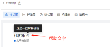
| Help text | Control whether the help copy is displayed in the chart. If enabled, client users can see a "?" icon after the chart title and the corresponding help copy when moving the mouse over the icon
| |
| Help text content | Enter a description of the chart here to help client users understand the chart data | |
每行列数 | 默认:4, 可选值:4,3,2
| |
指标卡样式
| 指标卡风格 | 支持用户切换:纯色填充,带侧边条 ,这2种展示风格 |
背景色值 | 支持用户自定义指标卡的背景色 | |
指标字号 | 支持用户改变指标卡中数字的字号粗细,颜色 |
