[Usage Scenario]
A line chart is a commonly used type of chart to display changes over time. It connects data points with lines to show the trend of variables, and is suitable for the following scenarios:
Time trend analysis: Line charts are suitable for displaying time series data, such as daily, monthly, or quarterly sales, user visits, or inventory changes, to help users identify long-term trends.
Seasonal changes: By observing the fluctuations of the line, it is possible to analyze the periodic changes in the data. For example, seasonal fluctuations in sales revenue, changes in user activity during different time periods, etc.
Comparison trend: Multiple lines can be used to compare the changes in multiple variables. For example, comparing sales trends of different products, or comparing user growth trends in different markets.
Abnormal discovery: The prominent peaks or valleys in a line chart help identify abnormal situations in the data, such as an abnormal increase in sales or a sudden decrease in user churn in a certain month.
[Function Introduction]
A line chart is used to display the changes in data over a continuous time interval or span, and its characteristic is to reflect the trend of things changing over time or ordered categories.
The composition of a line chart includes:
- Horizontal axis (X-axis): The horizontal axis in a line graph is the horizontal axis, usually used to display continuous variables such as data classification or time.
- Vertical axis (Y-axis): The vertical axis in a line chart is the axis in the vertical direction, usually used to display numerical values or quantities of data.
- Point: Each point represents the data value at a specific position on the horizontal and vertical axes. In a line chart, the line connecting all points can show the trend and change of the data.
- Line: The lines in a line chart are straight lines formed by connecting data points, representing the trend of data changes. The trend of the lines can intuitively show the growth, decrease, or fluctuation of the data.
【Basic Attributes】
| Horizontal axis | Longitudinal axis | Search Fields | Refernce Line | Filter conditions |
| Multiple fields can be configured, but up to 30 fields are allowed | Only one field can be configured | After configuration, the client can draw a line chart by searching for data that meets the criteria based on different search field values | Multiple fields can be configured, but up to 30 fields are allowed | Configure the condition values for filtering data sources |
[Configuration steps]
Step-1 Select Bar Chart
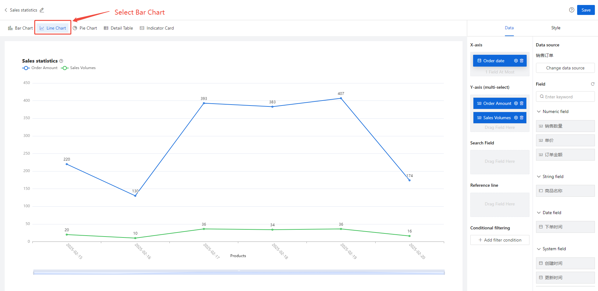
Step-2 Select chart display fields
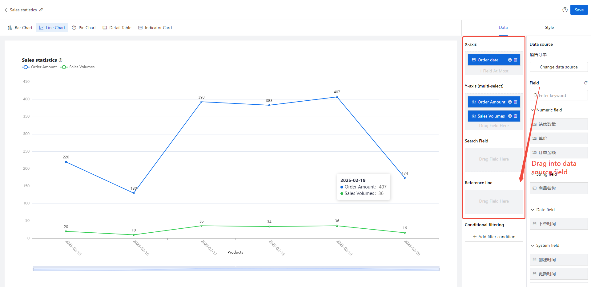
Drag and drop the fields from the data source list on the right onto the horizontal axis, vertical axis, search field, and reference line
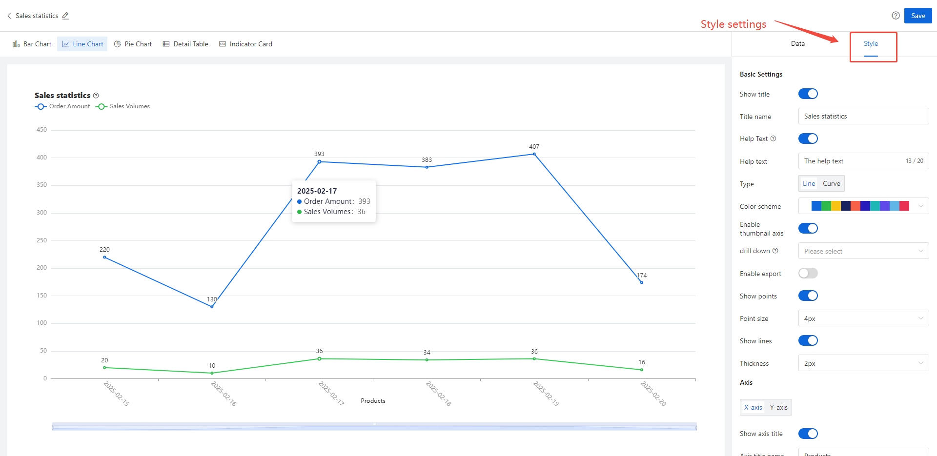
Step-3 Style settings
Divided into three categories: [Basic Style], [Coordinate Axis], [Legend], as shown in the following figure:
[Style Configuration Description]
| Classification | Configuration Items | Purpose |
Basic Style
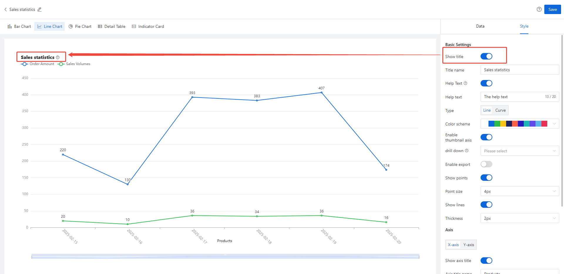
| Show heading | Control whether the chart title in the upper left corner of the canvas is displayed. When closed, the chart title will not be displayed in the report, The words "柱状图1" are shown in the following figure;
|
| Chart title | You can name the chart yourself | |
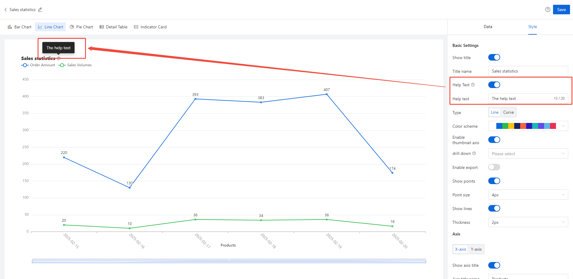
Help text | Control whether the help copy is displayed in the chart. If enabled, client users can see a "?" icon after the chart title and the corresponding help copy when moving the mouse over the icon;
| |
| Help text content | Enter a description of the chart here to help client users understand the chart data; | |
| Line chart type | Provide 2 types: line and curve
| |
| color scheme | Customize the color scheme of the Y-axis pillar; | |
Display thumbnail axis | Set a thumbnail axis for the horizontal axis, that is, to view the data of a certain interval on the horizontal axis;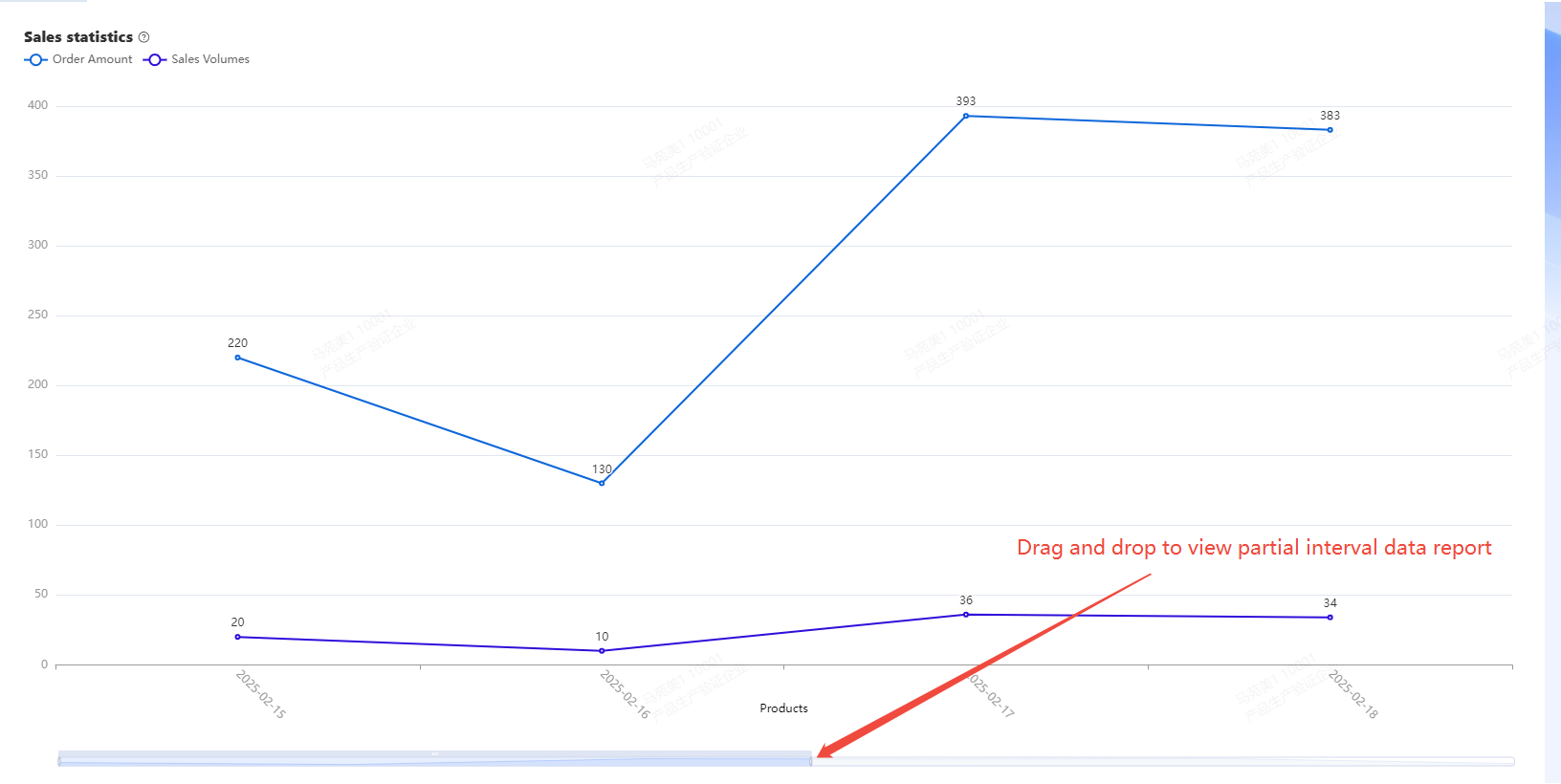 | |
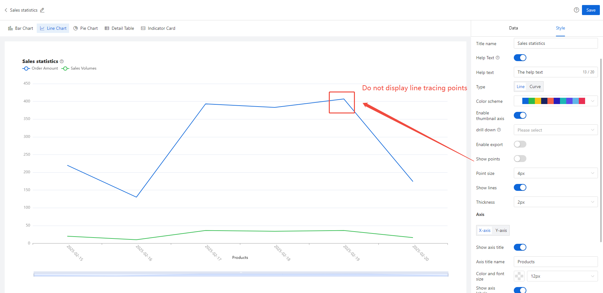
| Display point | By default, when turned off, each trace point of the line will not be displayed on the chart
| |
Point size | Control the size of the midpoint in the line chart
| |
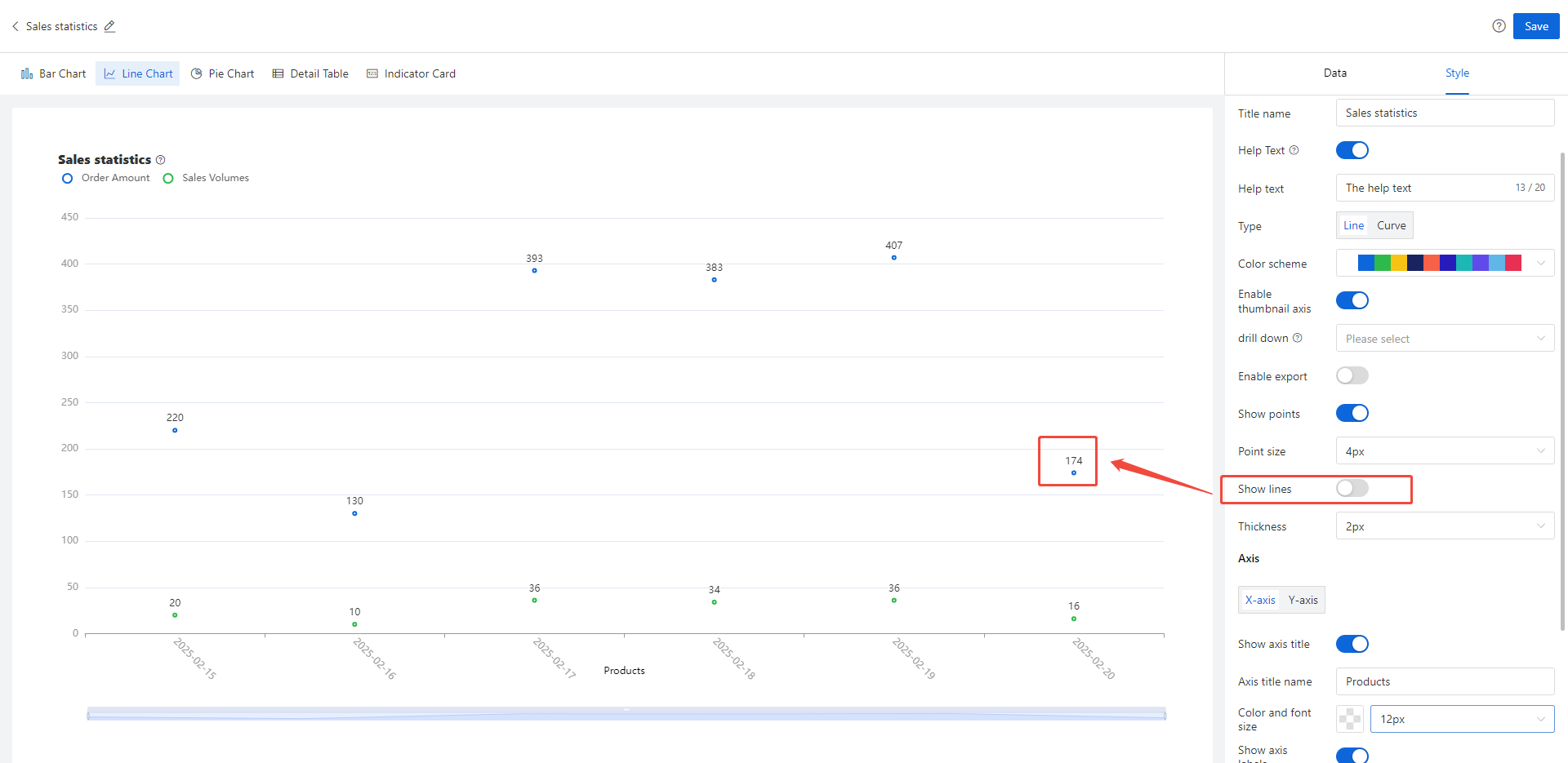
Display Line | By default, when turned off, the line segments of the line chart disappear and only points are displayed (similar to a scatter plot)
| |
Line thickness
| Support users to control the thickness of line segments in polylines | |
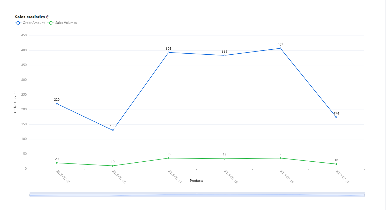
Horizontal axis
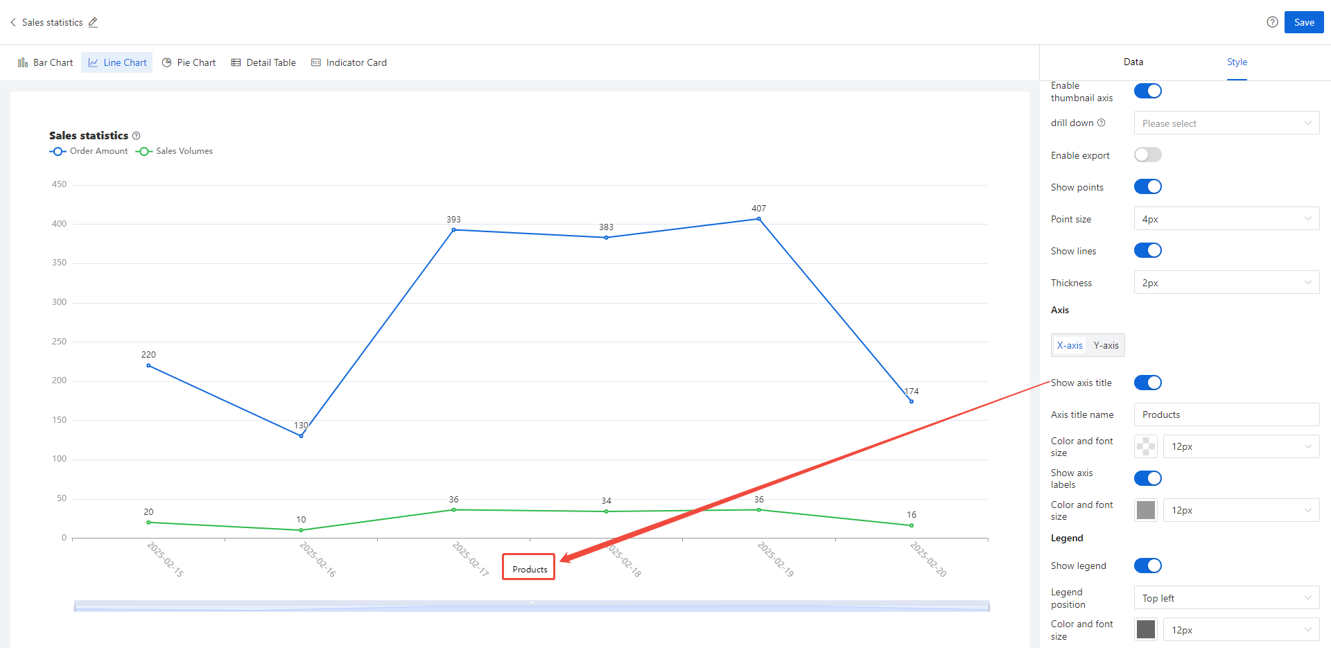
| Display axis title | After activation, the title of the horizontal data source will be displayed below the horizontal axis in the chart
|
Axis Title Name | Support users to customize the desired axis title name and text | |
| Color font size | Support user-defined color and font size for axis titles | |
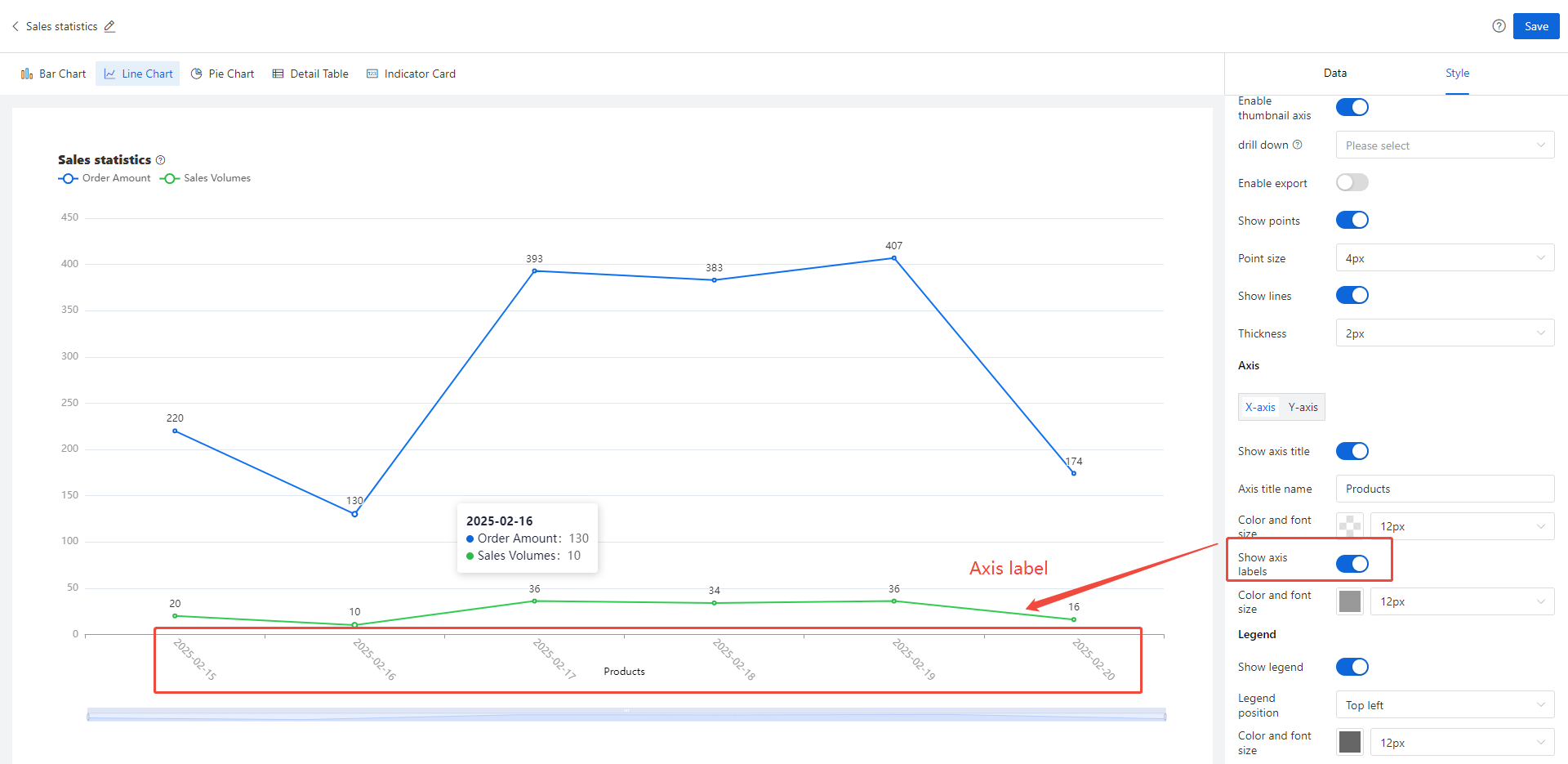
| Axis label | Control whether to display axis labels in the chart, as shown in the following figure:
| |
Longitudinal axis
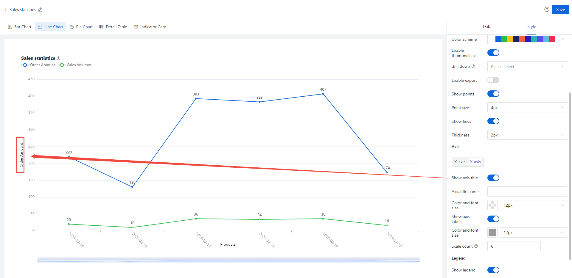
| Display axis title | After activation, to the left of the vertical axis in the chart, the title of the user configured vertical axis (the first data source) will be displayed
|
| Axis title name | Custom vertical axis title name copy | |
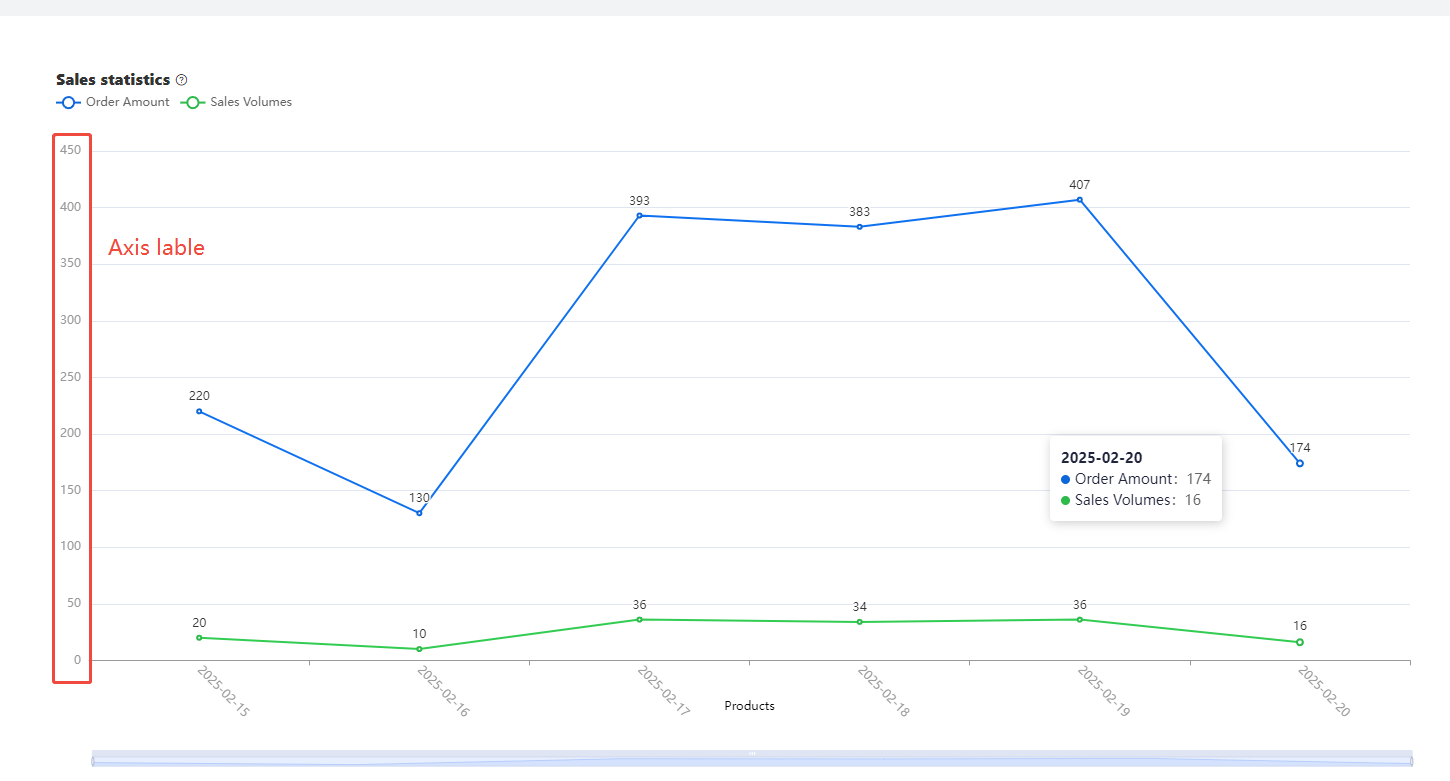
Show axis lables | Control whether the Y-axis label is displayed
| |
| Scale count | Customize the scale number of the Y-axis (note: the scale number here is an estimated value, and the report engine may change the final rendering scale number according to the actual situation during rendering) | |
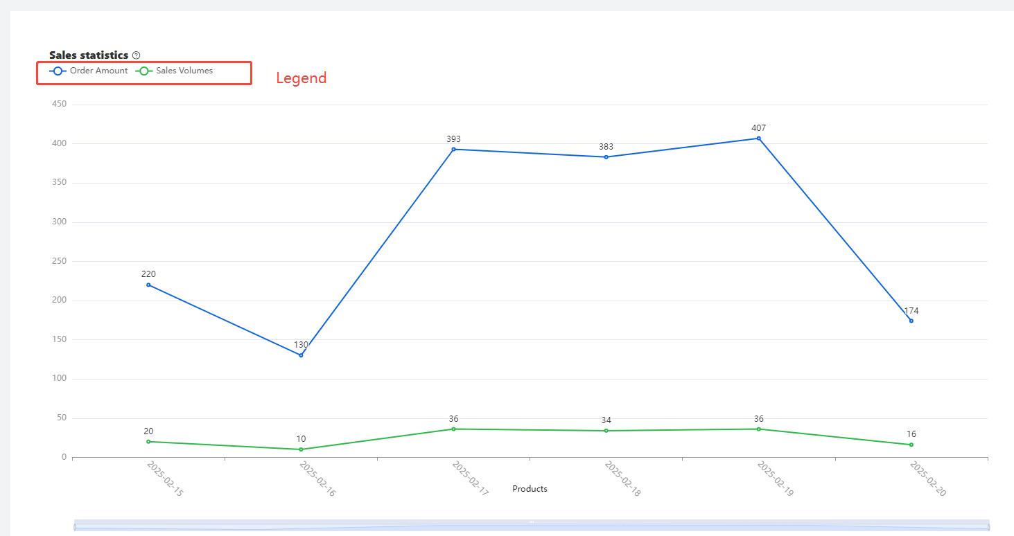
Legend | Show legend | By default, it is turned on, and when turned off, the legend will not be displayed
|
Legend location | The legend defaults to the top left corner of the chart and supports displaying the legend in other positions of the chart, such as the top center, bottom left corner, top right corner, bottom center, or bottom right corner | |
| Color font size | Adjust the text color and font size of the legend |