[Usage Scenario]
A pie chart is a commonly used type of data visualization chart that presents data as a circular shape resembling a pie chart, displaying the proportions of different data classifications in a fan-shaped manner. It is suitable for the following scenarios:
Proportional display: A pie chart is suitable for displaying the proportion or proportion relationship of different categories in the population. For example, market share, the proportion of various expenses to total expenses, etc.
Category Display: A pie chart can classify and display data according to different categories, visually showing comparisons between different categories. For example, the sales proportion of different products, the sales proportion of different regions, etc.
Trend analysis: By observing the size changes of each sector in the pie chart, the trend and changes of the data can be analyzed. For example, seasonal changes in sales revenue, changes in the proportion of users in different age groups, etc.
Highlights: Specific data or categories can be emphasized by highlighting a sector or several important sectors in the pie chart. For example, highlighting the market share of a certain product, highlighting the sales proportion of a certain region, etc.
[Basic Requirements ]
饼图的基本要求如下:
| 分类字段 | 数值字段 |
| 最多1个字段 | 最多1个字段 |
【操作步骤】
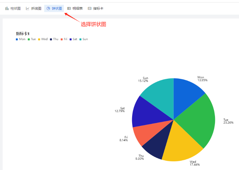
Step-1 选择组件,配置数据源
创建报表,在左上角选择饼状图,然后选定数据源,如图:
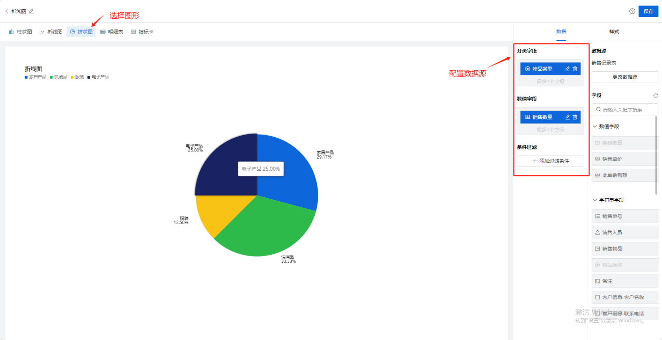
Step-2 选择图表展示字段
将右边数据源中字段拖动放到分类字段、数值字段上
饼状图的数据源:
有了分类字段和数值字段,就可以根据数据的实际情况,绘制出正确的饼状图。下图中:将分类字段拖入销售物品类型,数值字段拖入销售数量,则可以得出:【按照销售物品类型分类后的销售数量的统计饼状图】
分类字段: 本字段表示数据的类别或分类,每个数据点都应该有一个对应的类别。类别字段可以是产品名称、地区名称、部门名称等,用于表示数据所属的具体类别。
数值字段: 本字段表示每个类别的具体数值/数量。数值字段可以是销售额、销售数量、市场份额等,用于表示每个类别在总体中的比例或占比。
如果在数值字段(虚线框)中拖入非数值类型的字段(如:字符串、日期、地点类型),会根据默认聚合方式(计数),将字符串、日期、地点转化为该字段出现的次数
Step-3 样式设置
分为三小类:【基础设置】、【标签】,【图例】,如下图:
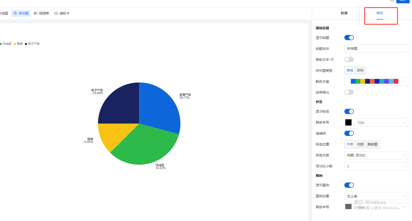
【样式配置说明】
| 样式设置分类 | 配置项 | 用途 |
饼状图
| 基础设置
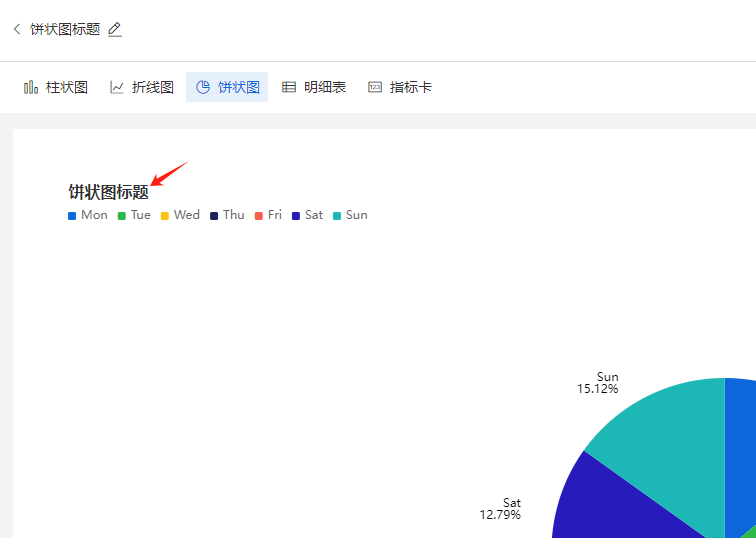
| 显示标题 | 控制画布左上角的标题是否显示的开关
|
标题名称 | 支持用户自定义报表标题 | ||
帮助文字 | 开启后,标题右侧出现小问号,鼠标悬浮时,出现帮助文字具体内容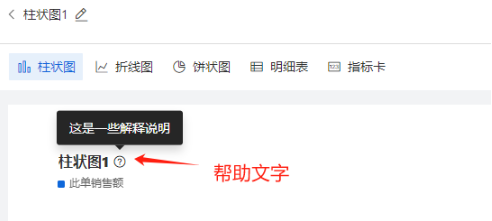 | ||
帮助文字内容 | 支持用户自定义帮助文字的文案,例如“本月销售总额统计” | ||
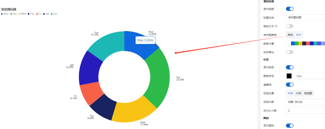
饼状图类型 | 默认选中“常规”,第二选项:环形图,环形图效果如下:
| ||
配色方案 | 支持用户自定义图形整体的配色方案 | ||
标签
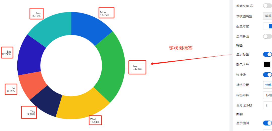
| 显示标签 | 控制是否显示标签的开关,如下图:
| |
颜色字号 | 略 | ||
标签位置
| 支持3种模式:内部,外部,蜘蛛图 | ||
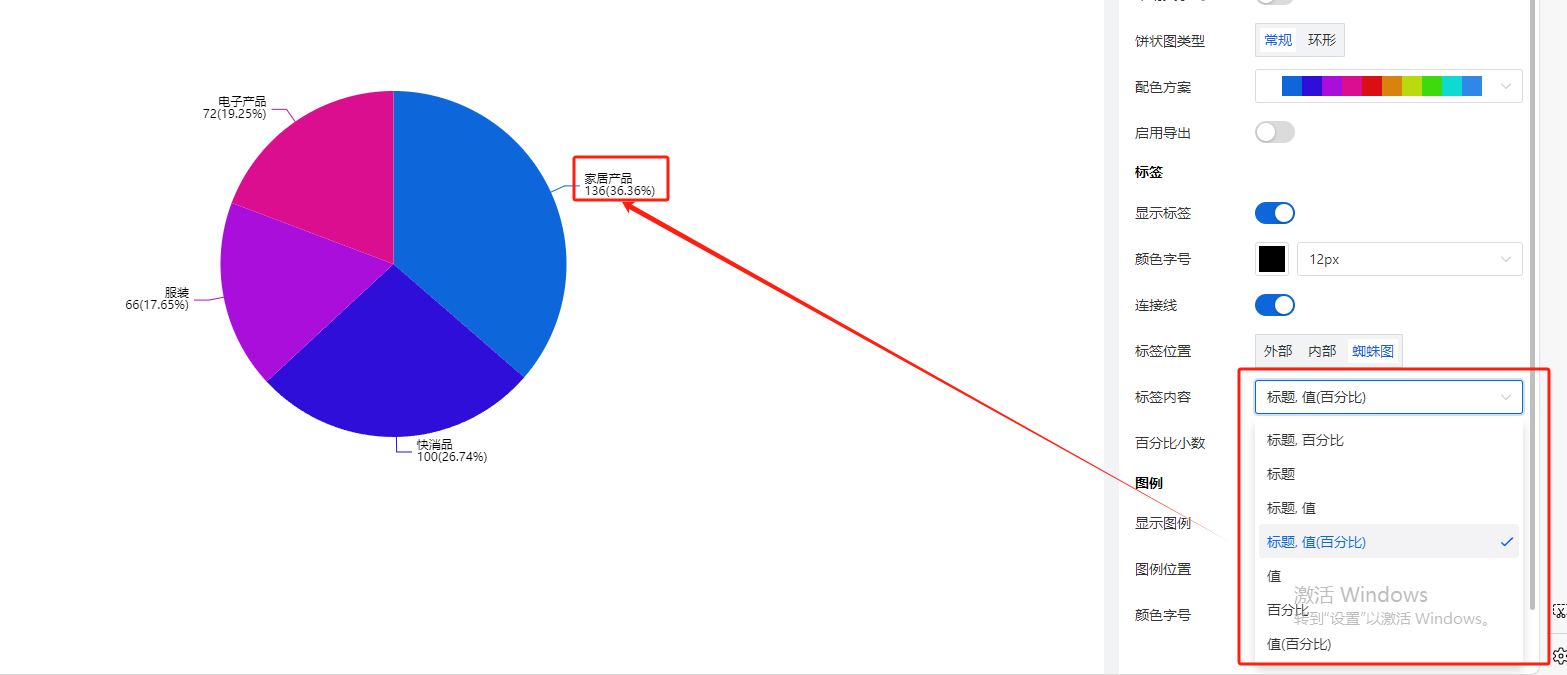
标签内容
| 是标题、百分比、值的各种排列组合,默认选择【标题,百分比】如下,用户也可以改成其他内容,例如“标题,值(百分比)”,如下图:
| ||
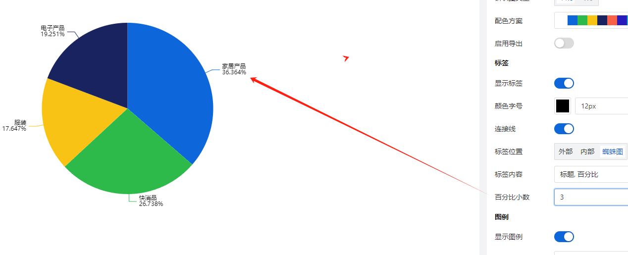
百分比小数位数 | 设置上述标签内容中,百分比的小数位数,例如设置成显示3位小数,如下图:
| ||
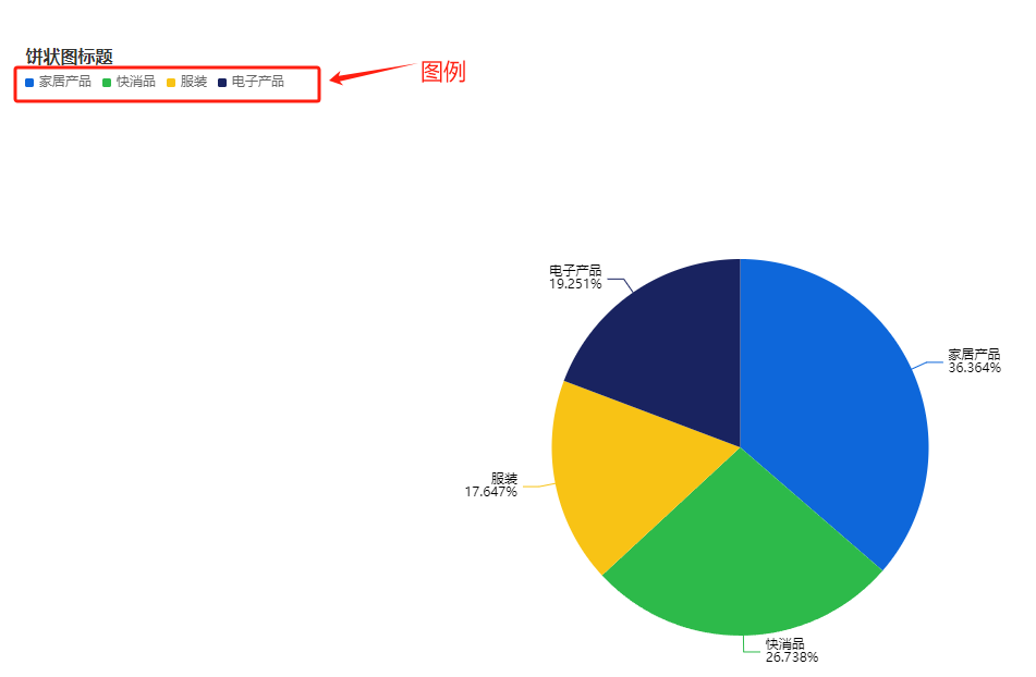
图例 | 显示图例 | 默认开启, 如下图:
| |
图例位置 | 图例默认出现在画布的左上角,同时支持用户设置图例在画布中的位置
| ||
颜色字号 | 支持用户根据需要自行调整图例的文字颜色和字体大小 |